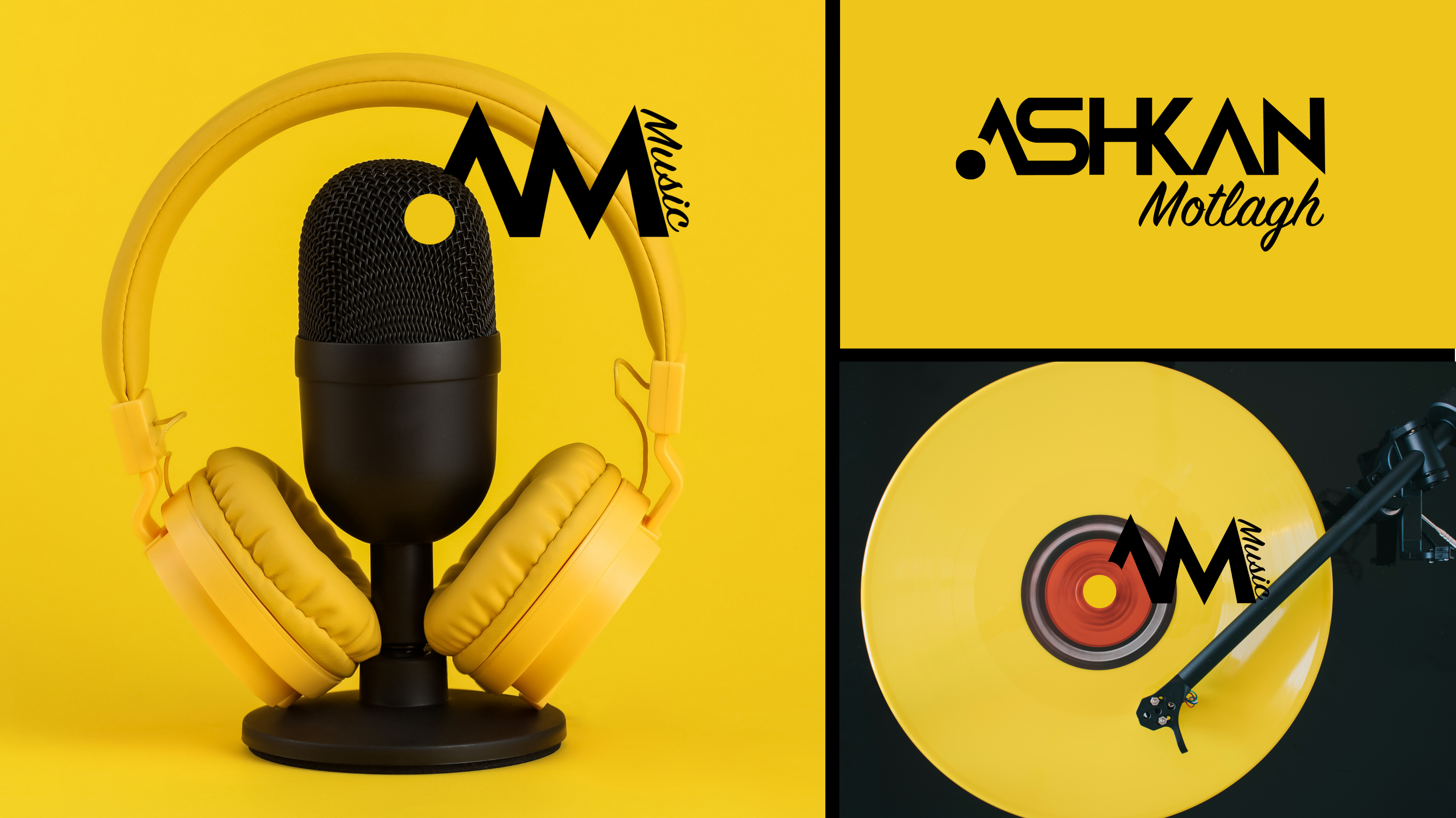
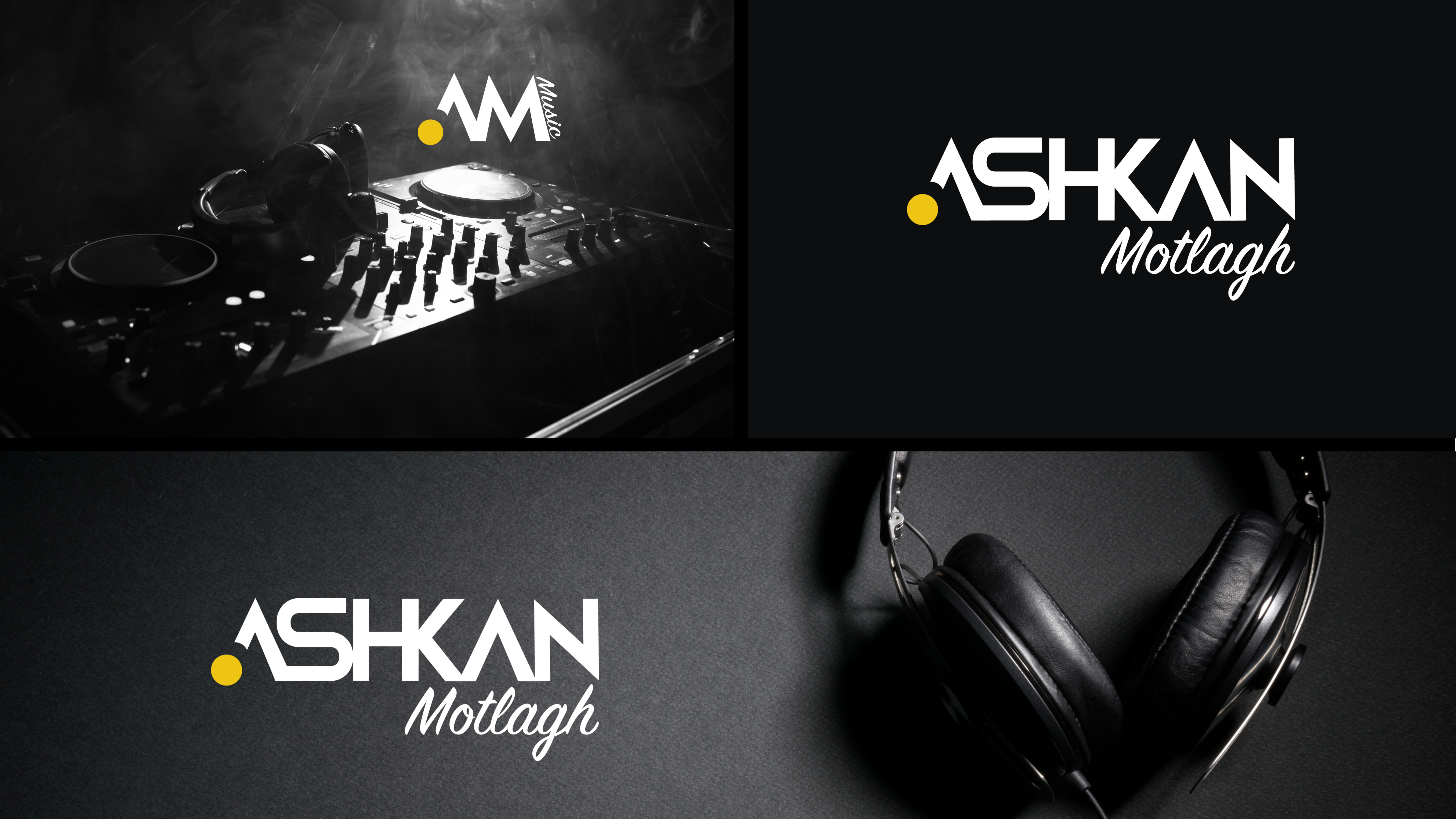
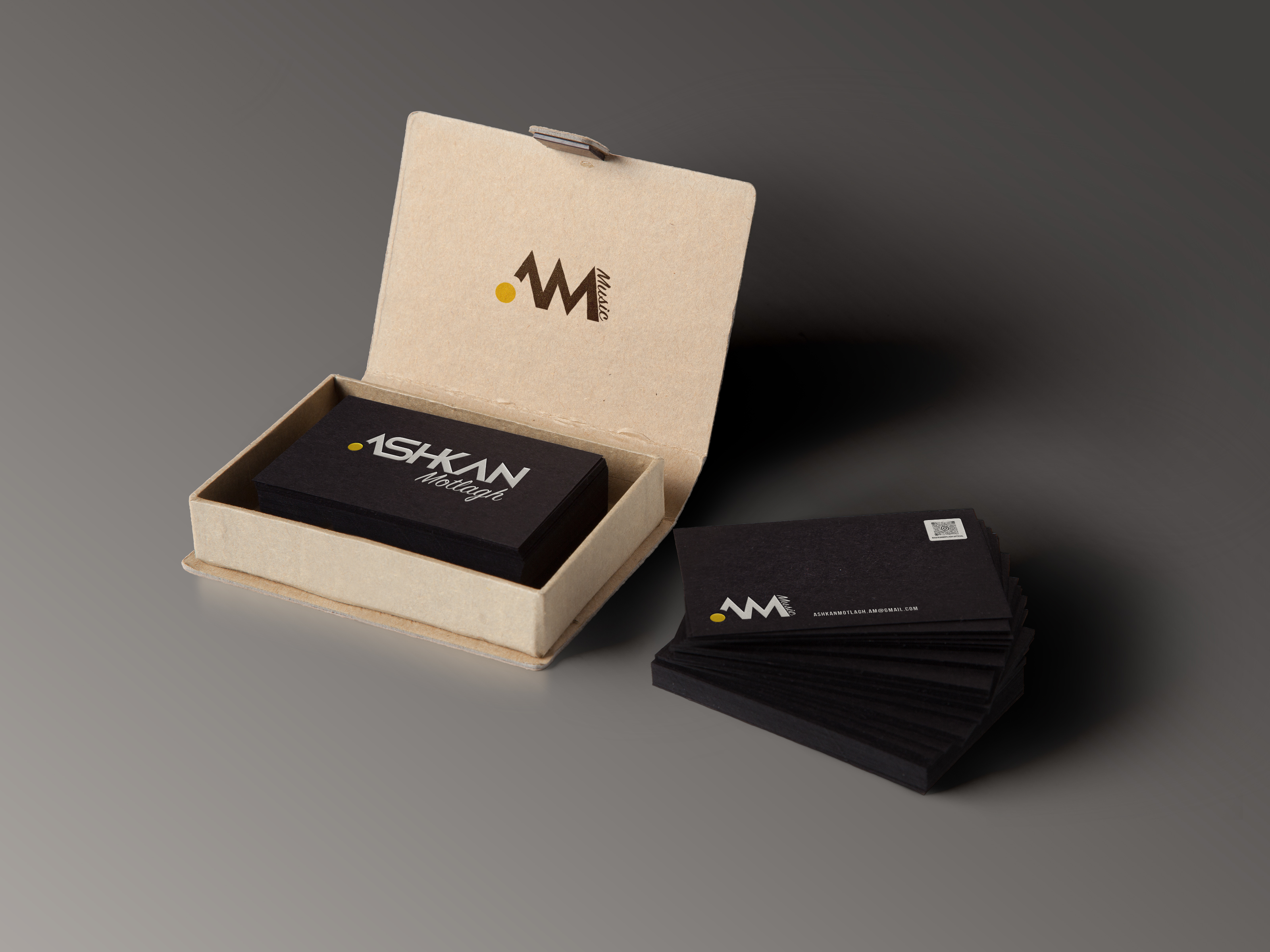
Ashkan Motlagh is a seasoned singer and DJ with over a decade of experience in both Iran and Sweden. Recently making his entrance into Canada , he seeks to establish his presence in the competitive Canadian market . To achieve this, he desires two logos : a primary and a secondary logo.


Challenges :
Solutions :
Ashkan’s vision for his brand identity is a fusion of modern simplicity with stylish flair, reflecting his playful yet professional persona. Selecting the right colors proved daunting , as he initially considered numerous options. He aimed for a typography logo that not only captures his name but also embodies his dual roles as a singer and DJ, with potential for future use in radio broadcasting. The challenge lay in crafting a single logo versatile enough for various applications.
- Collaboratively, we chose yellow to represent optimism and creativity in Ashkan’s logo.
- The typography incorporates his name and initials for individuality and community impact.
- A circle element symbolizes DJ surfaces, microphones, and the holistic nature of music.
- To address his long name, two styles were merged: sophistication and professionalism, and energy and playfulness.
- Culturally relevant fonts signal innovation.
- The logo encapsulates Ashkan’s identity as a singer, DJ, and future radio personality in the Canadian Persian community.


NAVIGATION
